From the Sketchbook
Sunday, May 18th, 2008I usually try to space out my work on Penance. Each panel typically takes me between 20 minutes and an hour to draw. How long it takes usually depends on the complexity of the scene or how familiar I am with the characters. When we’ve been following one storyline for a while, those characters become easier and faster for me to draw. When we switch to different characters, it can take a couple of weeks for me to catch up.
Much as I try to break up my work so that I only do a panel or two a night, most weeks it doesn’t work out that way. Between my classes, work, church, music, gaming, and everything else I do in my life, I often find myself on Sunday evening with six blank panels waiting for me to fill them. Then I do a marathon session to draw all six at once. Sometimes it works out — I get inspired and I manage to get the whole page done in about three hours. Other times I end up staying up way too late and still have some left to do on Monday. Most of the time when the page is late it’s my fault.
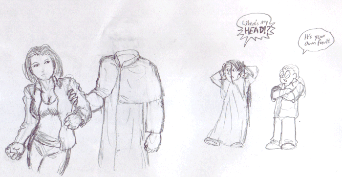
On this particular week, I was drawing the page where Marcus brings Tara to Mythband after being ordered by Ignatius to “take her home.” It was a crunch night if I recall correctly, and I was doing just fine until I got to panel 6. No matter what I did, I just could not get Marcus’s head right. As you can see from the pencil lines and eraser marks, I drew his head at least a half a dozen times. Every time it was either out of proportion, too cartoony, the wrong angle, or just didn’t look like Marcus. He just wouldn’t cooperate with me. Exhausted and frustrated, I erased what was there, finished drawing the back of his collar, doodled in the margin and went to bed.
The next day, J.D. went over my pencils. I promised her I’d try again with Marcus’s head, and she said “Let me see what I can do.” She went back through all our previous pencils of Marcus and found a page where I had drawn Marcus’s head in a similar front-on view. She resized and copied the previous head into the space I had left, and then printed it out for inking. When she was done, I was amazed. There was Marcus’s head coming out of that collar I had left empty!
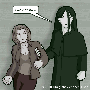
Here’s the finished panel:


May 19th, 2008 at 4:18 pm
NICE! Haha. That is really cool. I like the glimpse into the production side.
May 19th, 2008 at 5:25 pm
Okay, that is really awesome.
May 21st, 2008 at 5:04 pm
Maybe it’s just me, but the pencil sketch of Tara seems to express greater aversion and resistance, while the final version seems to be softened.
May 21st, 2008 at 7:09 pm
Both Tara and Marcus’ outfit look great on the sketch. There is some nice shading that is lost in the comic version. Of course, the comic should use the comic version; probably it would be impossible to use a style which takes the best from two.
May 22nd, 2008 at 7:33 am
Yeah, those are some really nice sketches. And about differences between the sketch and the comic, Craig uses more different types of gray to and shadows while J.D. only use 1 darker colour. That really makes a difference in how a drawing looks 🙂 Ow and Tara just look more angry in the sketch.
Same thing with the faulds (hope its the right word :P) in Tara’s cloth.
Really liked the ‘making of’ the comic, you guys should do that more often.
May 23rd, 2008 at 1:15 am
That cut&paste fooled me. Anyway, now that you mentioned that it does have slightly too long neck and head is teeny weeny bit too big. In your pencil sketchs I see that you use kind of “skeleton” in which you then draw body to surround that. You could go “Leonardo” for that head too. (you did know that many of Leonardos artworks were actually pretty much biologigal science works? Those are anatomically and biologically as close to reality as possible).
So “skeletonice” that head too. Shape and size and point of connection to spinal cord in right place and you are set.
Theoretically.
I don’t have any drawing skills, everything I draw looks like blueprints for constructing something. There is no motion, no life in my drawings. They are pretty correct in shape and looks, but they are not alive. My sister can draw galloping horse using single curvy line. I envy her.
May 23rd, 2008 at 11:15 am
Charles, I agree. I think there are two key factors that affect this….the eyebrows (particularly the one on the right) have a more aggressive height on the sketch and the pencile weight of the outline of the thumb appears heavier in the sketch (which implies a stronger fist).
May 24th, 2008 at 2:44 pm
That is awesome. Thanks for the humor/insight.
October 12th, 2024 at 2:36 am
???? 7k 7? casino ????????? ???????? ????????? ? ???????????? ????? ????????. ???? ?????????? ???????? ?????????? ?????? ??????, ??????????? ???????????? ?????? ? ?????????? ??????. ?????????? ?????????? ????????? ? ??????? ???????????? ???????? ?????? ???????? ??????? ???? ?????????? ? ?????? ?????? ?? ????? ????. ????? ???????, ?????? 7k ???????? ?????????? ??????? ??? ???, ??? ????????? ? ??????????????????.
October 12th, 2024 at 4:51 pm
???? 7k 7? casino ?????????? ?????? ????????? ???????? ? ??????? ????????????. ?????????? ???????????? ????? ???????????? ?? ?????? ?? ???????????, ??? ????????? ?????? ???? ? ???????? ?????????????. ?????????? ??????? ????? ??????????? ??????????? ? ????????? ?????? ? ???????? ?????????????? ??????, ??? ??????????? ????? ?? ???????. ????? ???????, ?????? 7k ???????????? ????? ??????? ?? ???? ?????? ?? ????.
November 3rd, 2024 at 12:32 am
Muchas gracias. ?Como puedo iniciar sesion?
November 9th, 2024 at 3:44 am
Muchas gracias. ?Como puedo iniciar sesion?
November 19th, 2024 at 12:21 pm
???? ?????? ??????? ?? ???????. https://github.com/sewer80/gamma